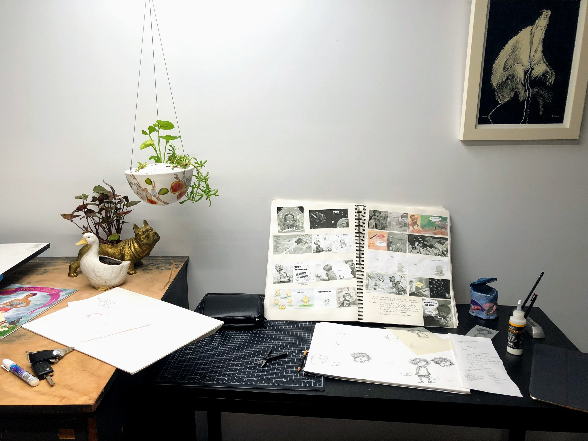
Scribblings and Mutterings from the Studio
Character Design Session One
I've had my eye on Schoolism courses for a while now, so when they launched a Kickstarter campaign allowing people to buy subscriptions and get access to all their courses, I jumped at the chance. But the end of last year was a bit of a mad flailing scramble (in which no dignity was preserved) so I had no chance to even look at it. BUT! It's a new year! New Year = New me, ammirite? So I've got started on Stephen Silver's fundamentals of character design.
Pigging Out
This is a quick and shameless public opinion poll. Whenever I'm designing a character I usually start with fairly realistic drawings, and then try to feel my way from there. That's what's happening with this little guy - my initial sketches have quite realistic proportions, but I'm leaning towards stylising him and making him cuter and stumpier. The final book is aimed at preschoolers, so I want my pig to be as appealing as possible for small people. Which look do you think our piggy rocks best? More true-to-life, or slightly cartoonified?


