Pigging Out
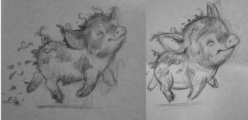
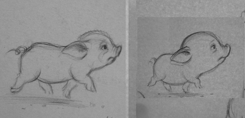
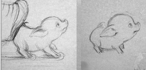
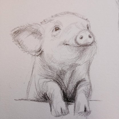
This is a quick and shameless public opinion poll. Whenever I'm designing a character I usually start with fairly realistic drawings, and then try to feel my way from there. That's what's happening with this little guy - my initial sketches have quite realistic proportions, but I'm leaning towards stylising him and making him cuter and stumpier. The final book is aimed at preschoolers, so I want my pig to be as appealing as possible for small people. Which look do you think our piggy rocks best? More true-to-life, or slightly cartoonified?


