The lure of the twist in the tale....
So, it was announced last week that The House on the Hill, written by the rather brilliant Kyle Mewburn and illustrated by some woman wearing mismatched socks has been shortlisted for the New Zealand Children's Book Awards in THREE categories - Picture Book of the Year, The Russell Clarke Award for Illustration, and the Children's Choice Awards. That's a bit good. Thanks so much to the judges and everyone involved - organising awards requires a lot of effort and investment from a bunch of dedicated people who are mostly volunteers, and they do wonders for keeping children's books alive and kicking, and children happily reading. To celebrate, I thought I'd make a Behind the Scenes blog post and tell you a little about how the book came together. It's long and self indulgent, so proceed at your own risk.
(Note from Sarah's lawyer: To proceed beyond this point is to agree to the Terms and Conditions of this blog post, which are as follows:
1) You will not resent the amount of wasted time that has been subtracted from your life while reading this, which we estimate to be an average duration of 8.3 minutes
2) You will not roll your eyes or make gagging noises at the bad childhood poetry included in this blog post.)
The House on the Hill is a picture book in verse, a homage to Edgar Allen Poe, and a story with a very satisfying twist in its tale - a twist the Little Sarah would have loved. I check in with Little Sarah as my arbiter of whether or not a picture book is worth illustrating, and she gave this one the thumbs up. It reminded me of this poem Little Sarah wrote when I was twelve:
Ghastlies and Ghoulies and snaggle toothed beasties
Creep from the corners, crawl through the door
All crowded round vying for my attention
while slimy green worms scramble over the floor
Skeletons rattle out death in a corner
dry and forgotten a decade or more
Demons cavort in a wild dance of horror
A giant stuffs struggling frogs in his maw.
Witches swoop through the air swing sacks full of sewage -
Soup for the feast that we're having tonight -
And a snaggle-toothed hag screams at me from a corner,
"Hey Nick! Do I look enough of a fright?"
A spectre whirls round with a dry putrid pudding
That's grown arms and legs on account of a spell,
And a goblin drinks pig's blood hunched over a barrel,
Hiccuping terribly, burping as well.
It's Halloween night and we're all having great fun!
Feasting and howling, me reigning supreme.
Well, if you'll excuse me I'll just clean my horns up,
Polish my trotters and practise my scream.
So clearly Little Sarah approved of macabre subject matter immortalised in verse, and this was a book for which I needed to do pictures.
My husband is American, so Halloween is one of the Festivals of His People and we use it as an excuse for a big party. One year, Dave was so dedicated he made Baked Cemetery for our dinner... soil made from a delicious sauce of beans and mince covered with grass made of mashed peas, and tombstones carved out of potato, as well as little sculptures of Dracula, the Wolf Man, King Tut's mummy - all hand sculpted from spuds. We get a little bit enthusiastic about the whole thing. So when I read the text for The House on the Hill, I knew I was going to have some fun with it.
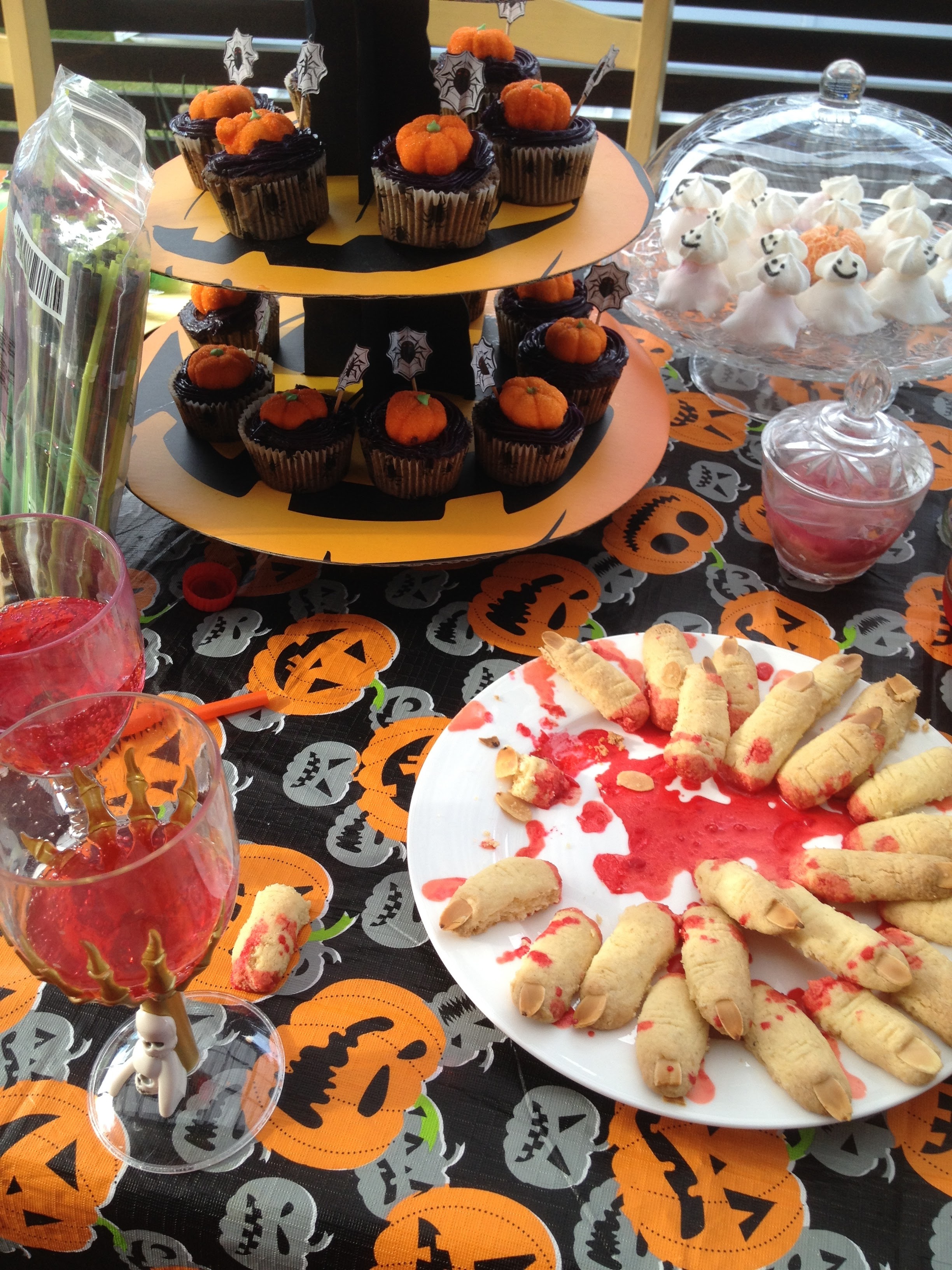
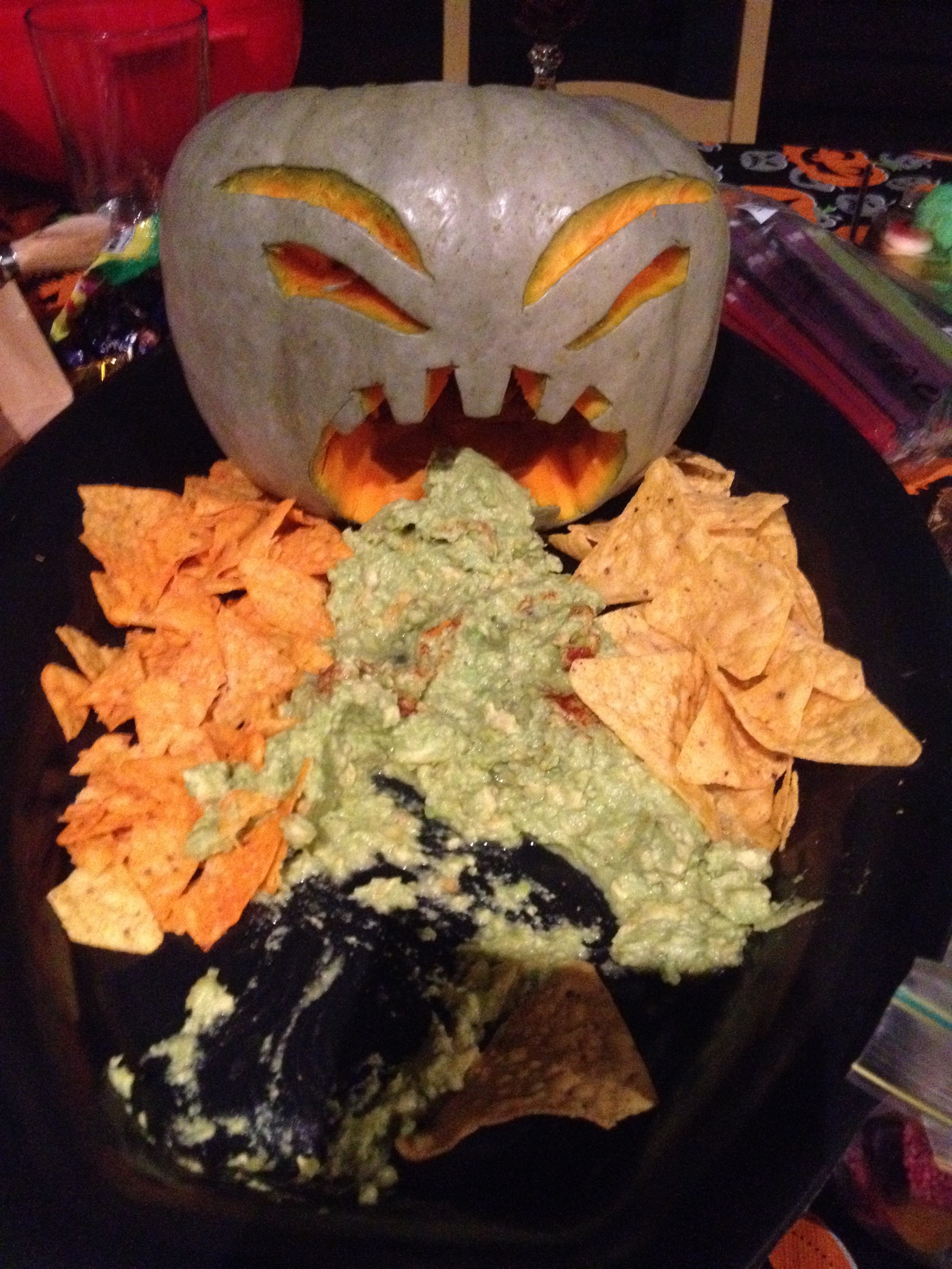
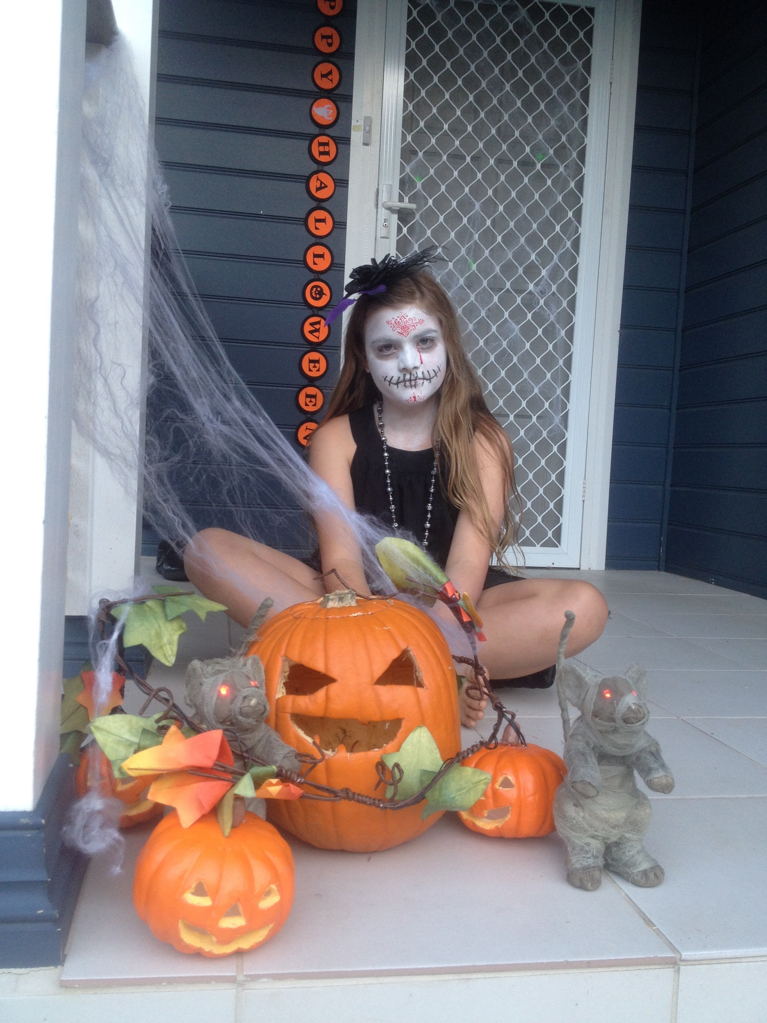
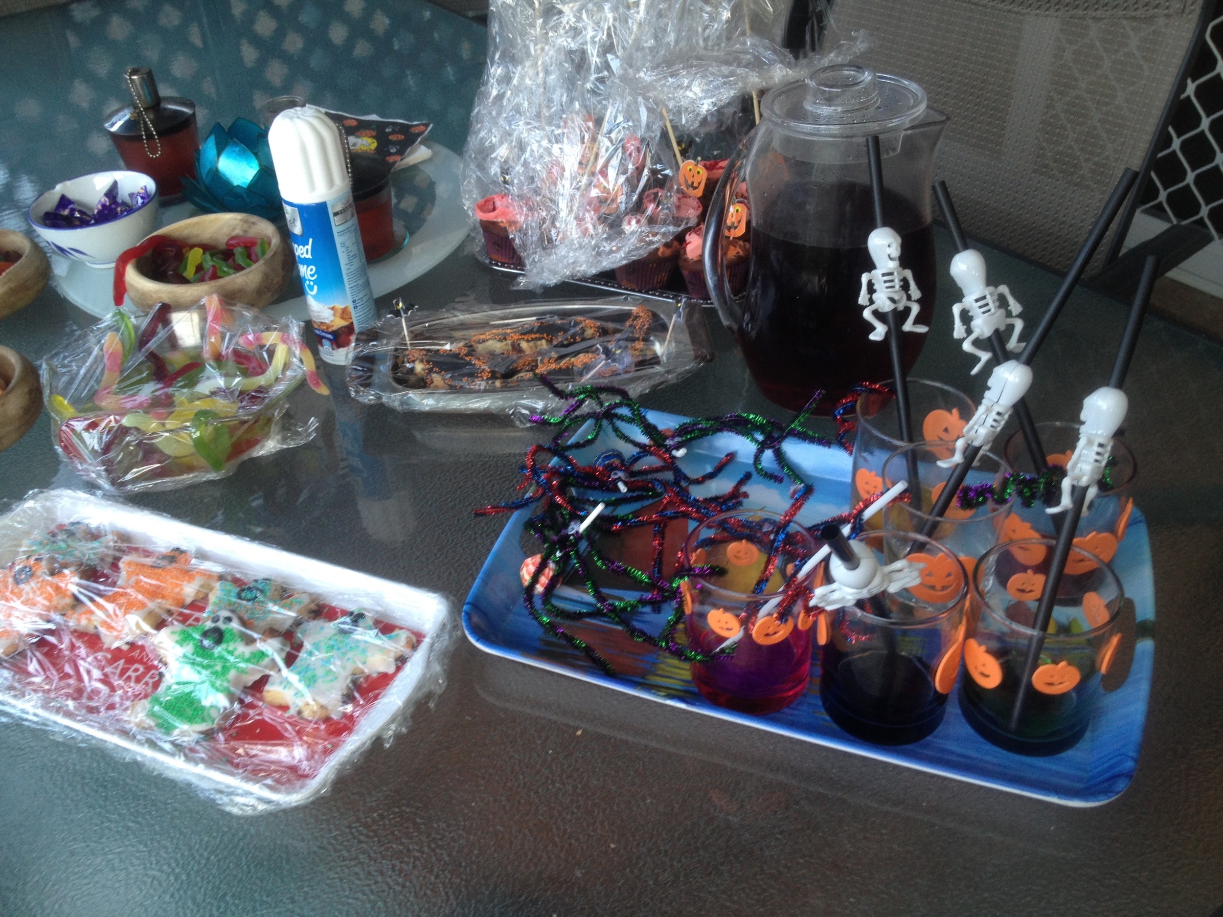
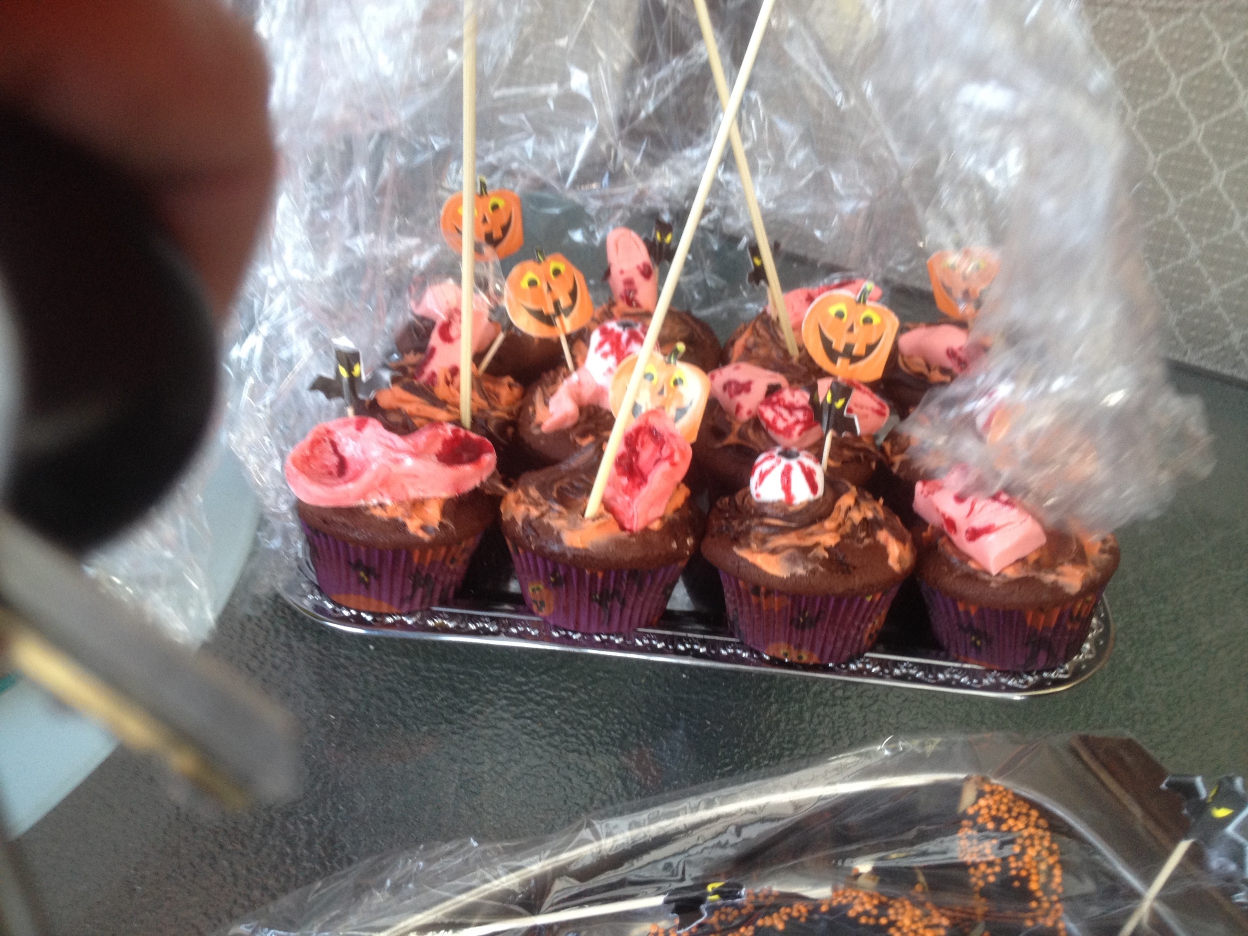
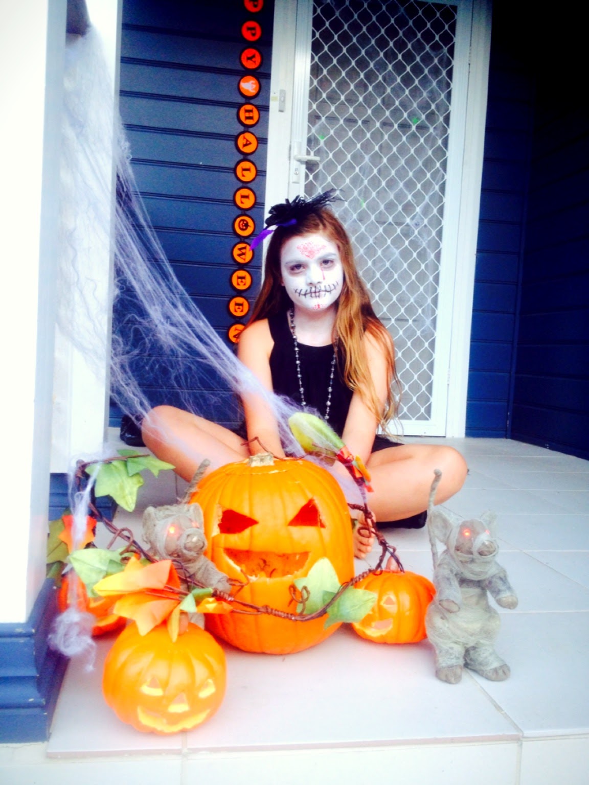
Here's what our Halloweens look like, severed finger shortbread biscuits, puking pumpkins.... you get the idea.
Kyle's House on the Hill text was an unexpected treat - the delightful melodramatic tone and the complex evocative language, coupled with the fact that it's a direct tribute to one of my favourite writers, gave me lots of scope. I think it deserved a better illustrator, if I'm being brutally honest! (which of course I am - I was a girl scout and all. ) The challenge was to build suspense and make the twist at the end of the story satisfying, and to keep the pictures engaging even though I couldn't show the faces of the main characters at all. That's the reason I thought it would be a good idea to have a little black cat accompanying the ghosts - the cat could be expressive on their behalf. I wanted the illustrations to have lots of drama and atmosphere, so I decided the best way to achieve that would be to really try and push tonal extremes in the pictures. I did a lot of research into the Japanese concept of Notan - designing with light and darks. If you're interested in finding out more you can click here for an excellent exploration of the concept and here's a fun craft activity to fill a rainy afternoon.
But! Then! The twist at the end of the tale! In which it is revealed....
....spoiler alert......
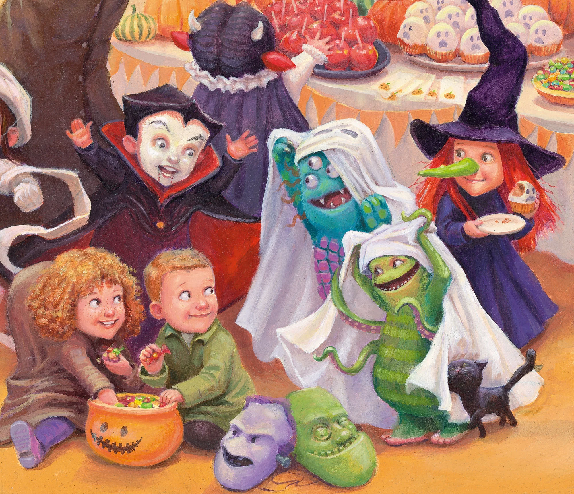
...that the two ghosts are really human children, and their epic quest to the House on the Hill is really a trek to a Halloween party. I liked the idea of having the first part of the book in sepiatone, because when you're a kid and you dress up, you like to imagine that the world around you has changed with you, and that you've entered a new, heightened reality with much at stake. So I wanted the world in the early illustrations to be as dramatic as our little ghosts might imagine it to be. That's why they needed to be monochromatic with extreme lights and darks. But I had the idea that this could change when the twist was revealed, and normality could be reasserted... so here are my initial roughs for those spreads and the two final oil paintings: you can click on the thumbnails for a larger view if you like details.
The idea was that I could shift from monochromatic sepia inks to warm oil paints (in my next post I'll post a video of the painting process.) But in the end it was thought there was too much of a shift between the two styles, and that it sort of felt like two different books, so these two final oil paintings got cut and never made it into the book in the end. It's hard to put so much work into something and then have to let it go, but sometimes it has to be done.
(You might also notice that at one point I wondered whether it needed to be human children under those sheets at all... but these little guys didn't survive the reworking. )
So here are the final spreads as they appear in the book. We decided to reach a happy compromise - I would do the final two spreads in ink and colour them digitally to minimise that disconnect between the two styles. And we ended up with something that kept a nice aura of mystery, I think, with a final image that blends the two worlds.
Okay, I think that's just about enough self-aggrandising introspection for one blog post. I'd just like to end by mentioning my dedication. Kyle wrote the book as a tribute to Poe, and penned his dedication in the same style, so I shamelessly copied him hoping to ride to glory on his coat-tails. As they used to say in the Victorian era. So I tried to match the rhyme pattern and metre of the Raven, the first verse of which reads like this.
Once upon a midnight dreary, while I pondered, weak and weary,
Over many a quaint and curious volume of forgotten lore—
While I nodded, nearly napping, suddenly there came a tapping,
As of some one gently rapping, rapping at my chamber door.
“’Tis some visitor,” I muttered, “tapping at my chamber door—
Only this and nothing more.”
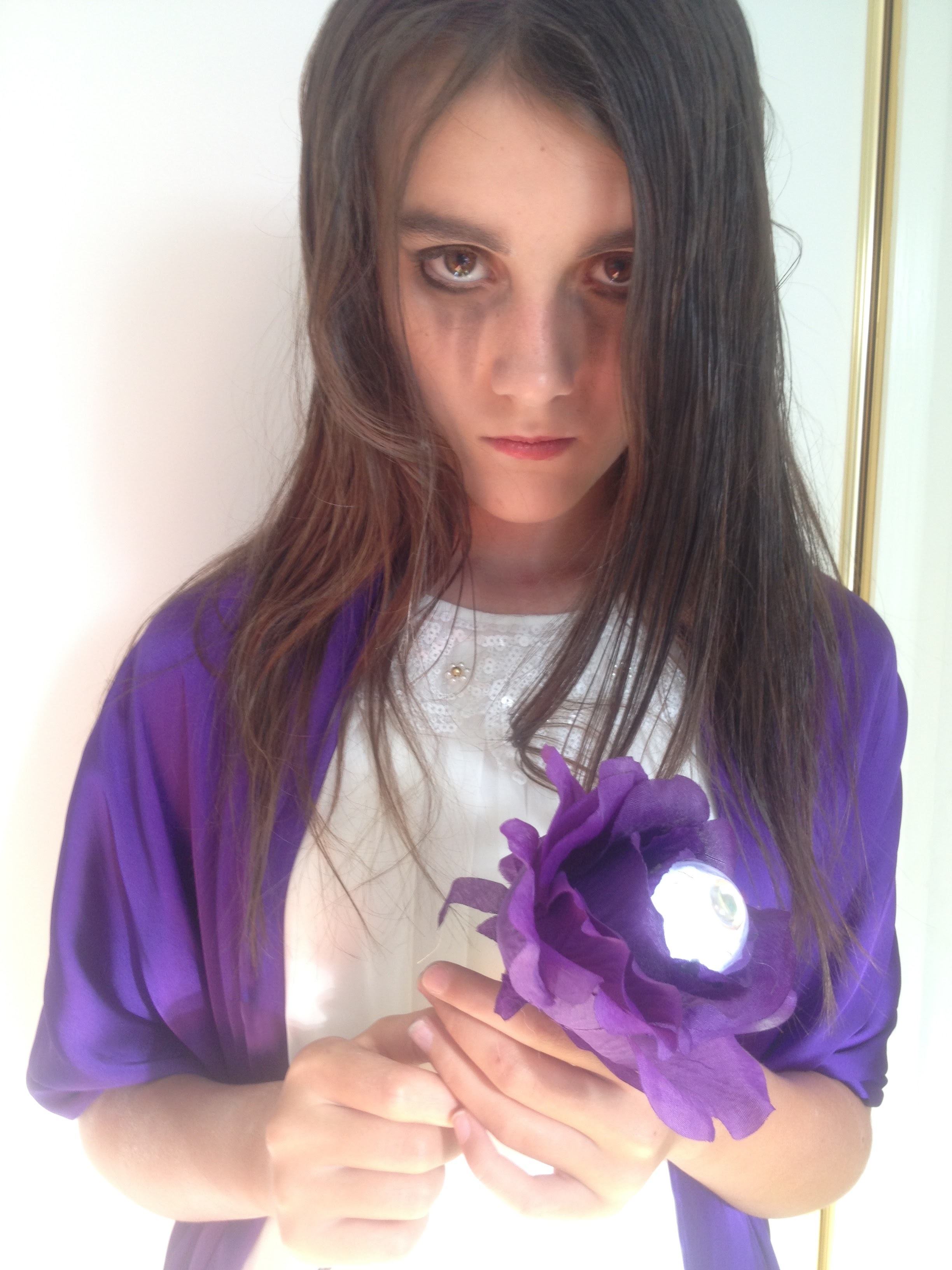
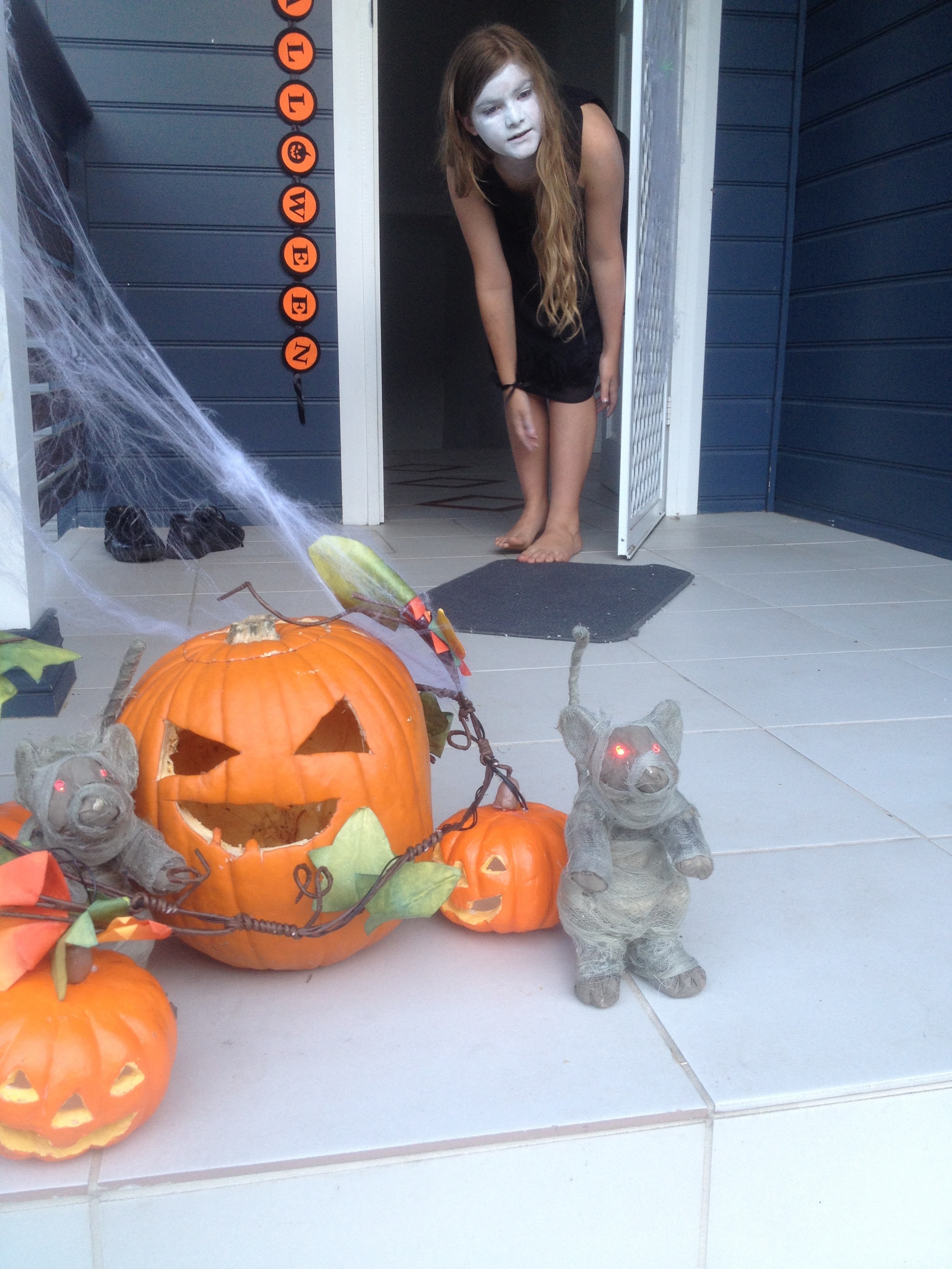
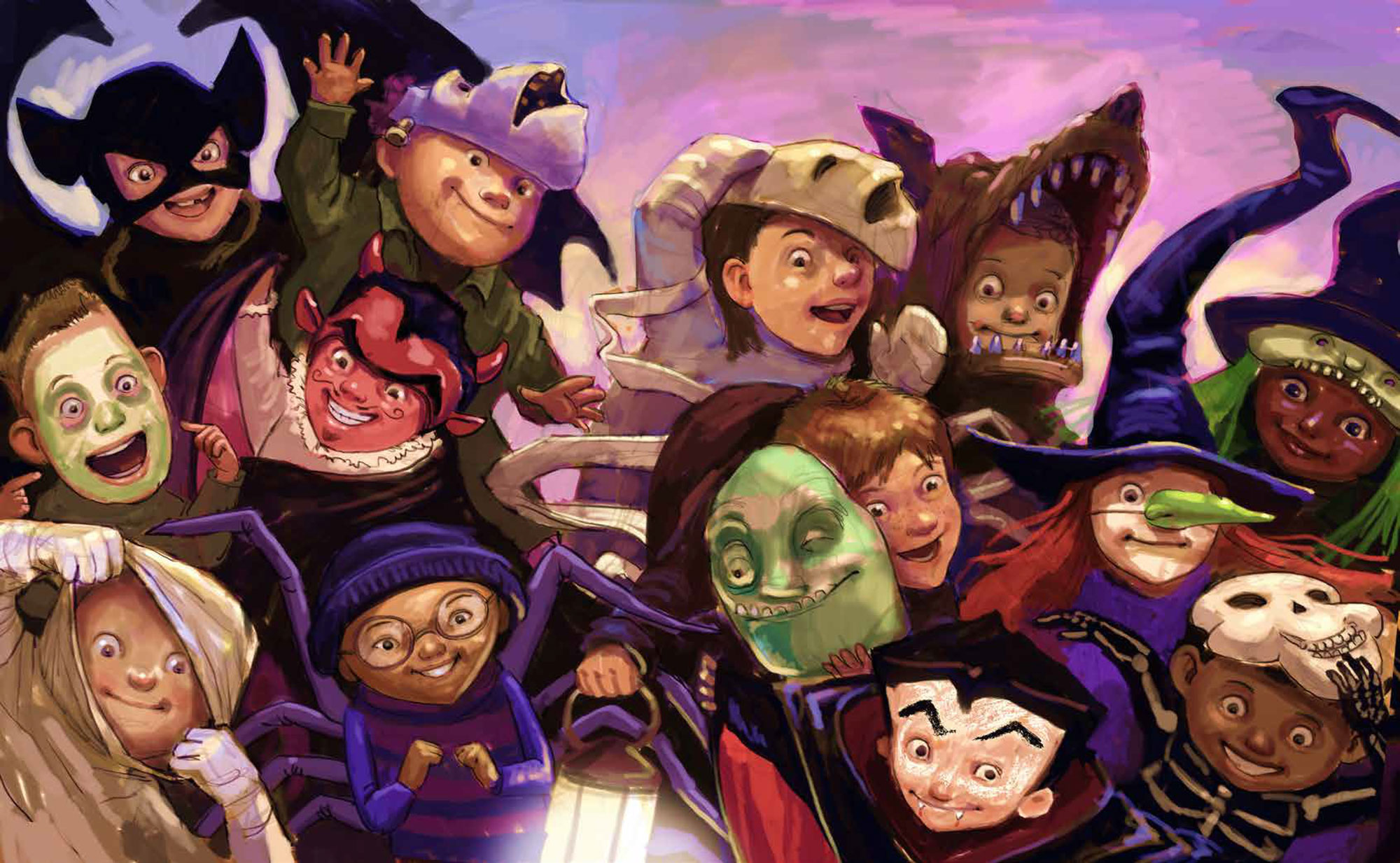
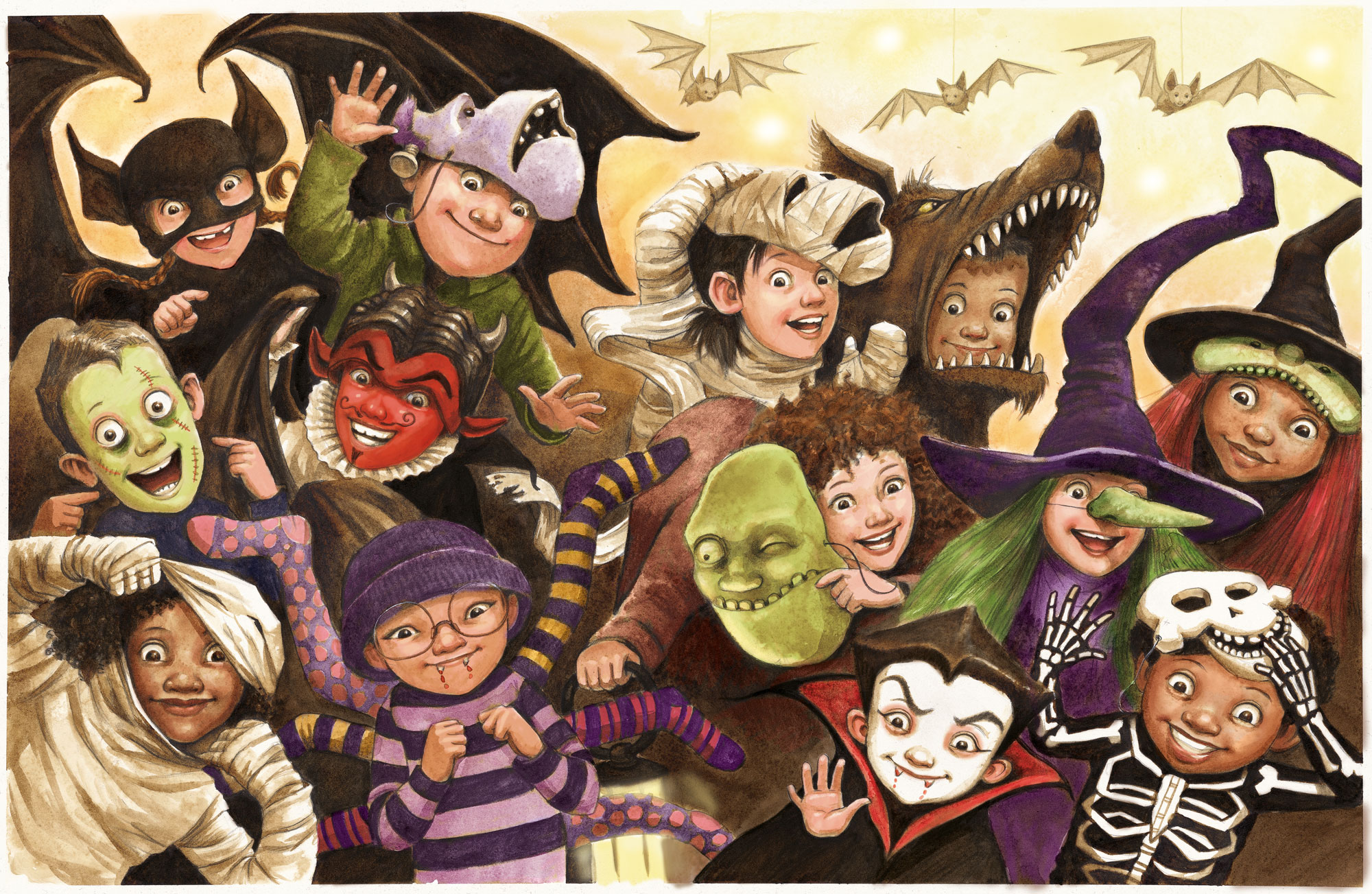
You can read the full poem here, or better yet go out and buy a good oldfashioned leather bound tome of Poe's complete works. My dedication is dedicated (well duh...!) to my kids, and how incredibly seriously they took their dressups. To Finn, in particular, who made a fearsomely cute Wolfman.
“For those cunning little creatures who attempt to hide their features
Behind terrifying homemade mask or gruesome face-paint gore,
Though your fearsome shrieks are chilling, and your wicked glare is killing,
It’s your own true self that’s thrilling us and filling us with awe.
Your disguise hides something precious, and we realise with awe –
We just couldn’t love you more.”

