Kevin Hawkes at the SCBWI conference in New York
I haven't posted much recently because I've been busier than a one-legged Riverdancer, with five books due by June! But I thought I better grab the occasional brief moment to pontificate a little about the Society of Children's Book Writer's and Illustrators conference in New York, because it was great fun being there, and it may be of interest to one or two of the three people who read my blog! (Hi, mum!).
I went to the illustrator's intensive day, and Kevin Hawkes gave a great talk about his working methods, and gave us some creative ways to think about illustration. If you don't know him, check out his website - he's illustrated some of my favourite books, like Library Lion, Weslandia, and By the Light of the Halloween Moon.
It was interesting to hear that he works the same way I do, when he has a book on the go - he has all the paintings mounted on boards and works on them all in rotation, so they're always at the same stage of completion (or incompletion, in my case!) I cottoned on to that idea when I kept getting caught short by deadlines and having to rush the final pictures - to me it's obvious which ones they are, and I'd happily sneak around and glue those pages shut in every copy of the books. So it makes sense to have them all on the go at once, and it's also easier to check for consistency in colour and character too. He usually starts with blank surfaces, and then goes round and scrawls one dynamic mark on each, just to kick it off, and then often bases his composition around that initial stroke.
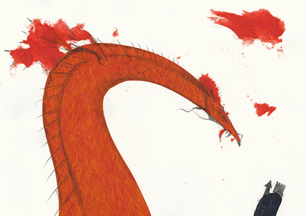
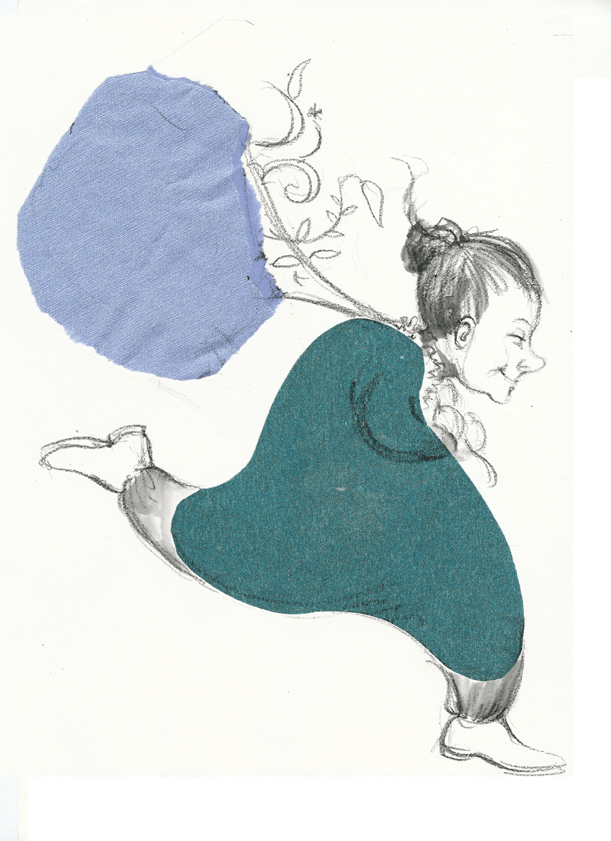
In this vein, he also got us playing with paper and glue, and it was quite an enlightening exercise. We had to tear or cut two shapes that expressed happiness, and two shapes that expressed anxiety. Then we had to arrange them on a page, and turn them into a picture by drawing over the top. It was an exercise that highlighted the way an interesting compositional shape can add energy and emotion to an image, and also offers a way to begin composing an image - a creative starter that can free you up and make you think laterally if you're a bit blocked. I've been thinking for ages that I'd like stronger dynamic graphic shapes in my illustrations, so I found it useful. Here are the two pictures I came up with. . Which one expresses happiness, and which embodies anxiety? Well, you'll just have to work that out for yourselves!


