
Illustrating Mending Lucille - step by step...
Each story has its own particular atmosphere, and before I start drawing I need to get a sense of the spirit of the story, and work out how to express it in pictures. So, once I'm sent the text, I spend a long time with it. I read though it again and again, trying to absorb the atmosphere of the words, and let any evocative images rattle around in my head. With Mending Lucille, that meant going through at least a box of tissues, because every time I got to the ending I'd get all teary-eyed. What a big sook.
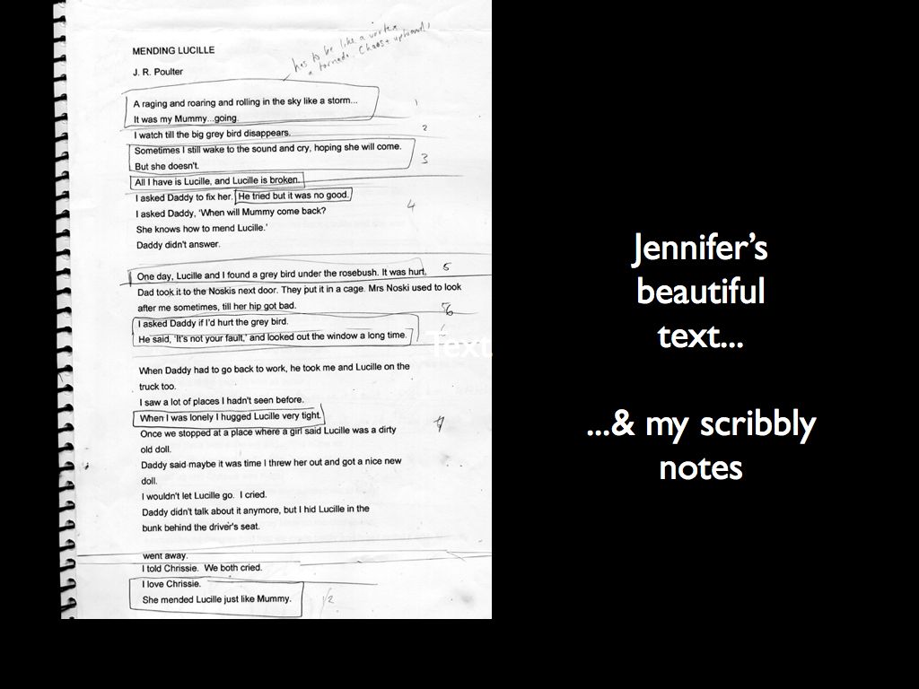
Here's my initial printout of Jennifer's manuscript with my scribbles all over it. At this stage I'm just trying to isolate key phrases or images that I want to highlight in the final pictures. (That's why I have all those sentences circled. They're the juicy bits!)
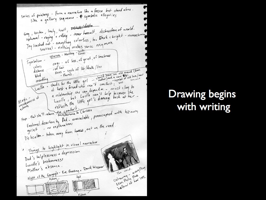
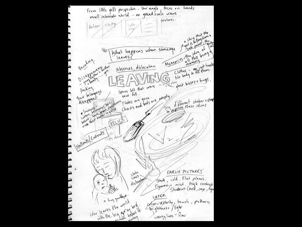
Then I actually start by writing and scribbling, sorting out my ideas about key images, ideas, color schemes, character relationships, anything that comes to mind..
.
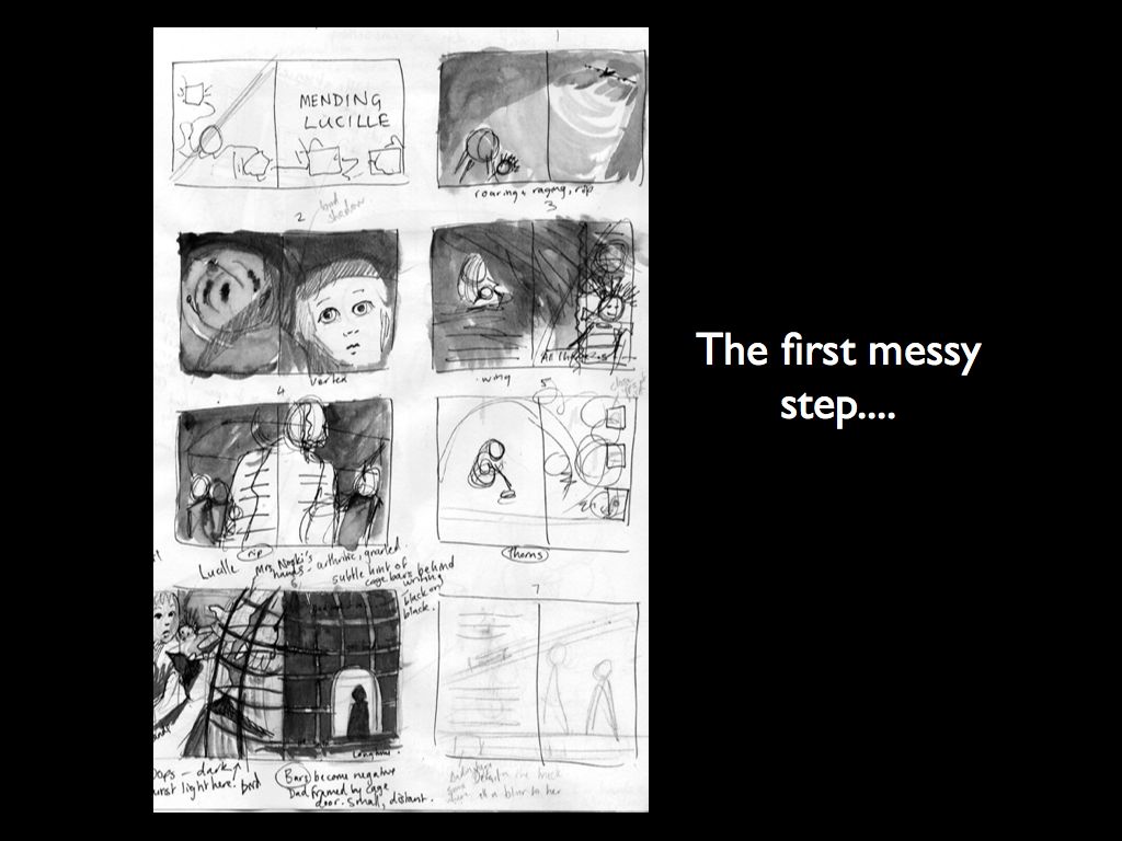
The next stage is to begin translating these ideas into images. At this stage it's unbelievably messy - scribbly, tiny thumbnails that no-one but me can understand - and even I have trouble! But here I start to think about how some of the key ideas would work visually.
In this book I wanted to play on the idea of breaking and mending, since the story essentially focuses on what happens when the little girl's reality is torn apart, and how she ultimately puts the pieces back together again. So I decided to use collage with lots of torn edges and actual stitching in the final illustrations. Here's one of the illustrations followed from initial rough idea to final art with text. I wanted this spread to emphasise the trauma of the mother's absence, the loneliness and sadness of the little girl and her father, and the distance between them. So, I hit upon the idea of the shape of the mother making the space that seperates them from each other, since it was her disappearance that has caused their hurt. I decided that the only way to show the trauma of their loss was to actually physically tear the shape of the mother from the finished painting. So, here's my original idea...
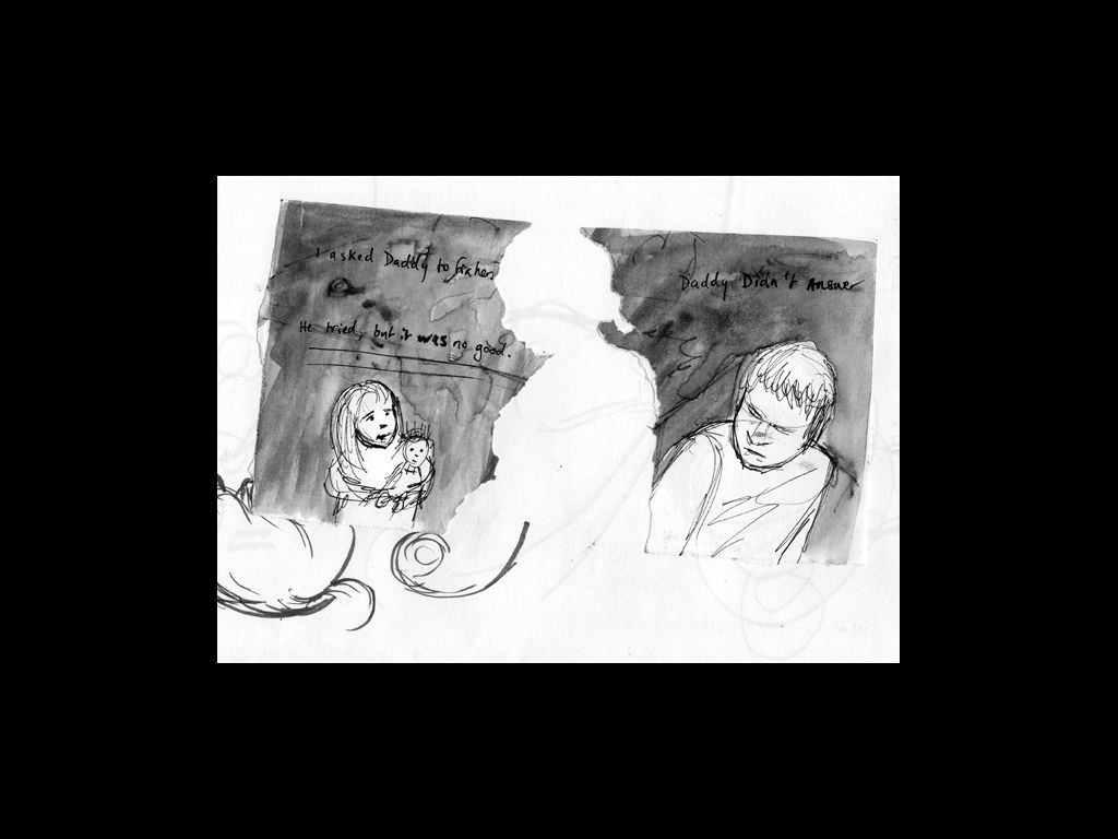
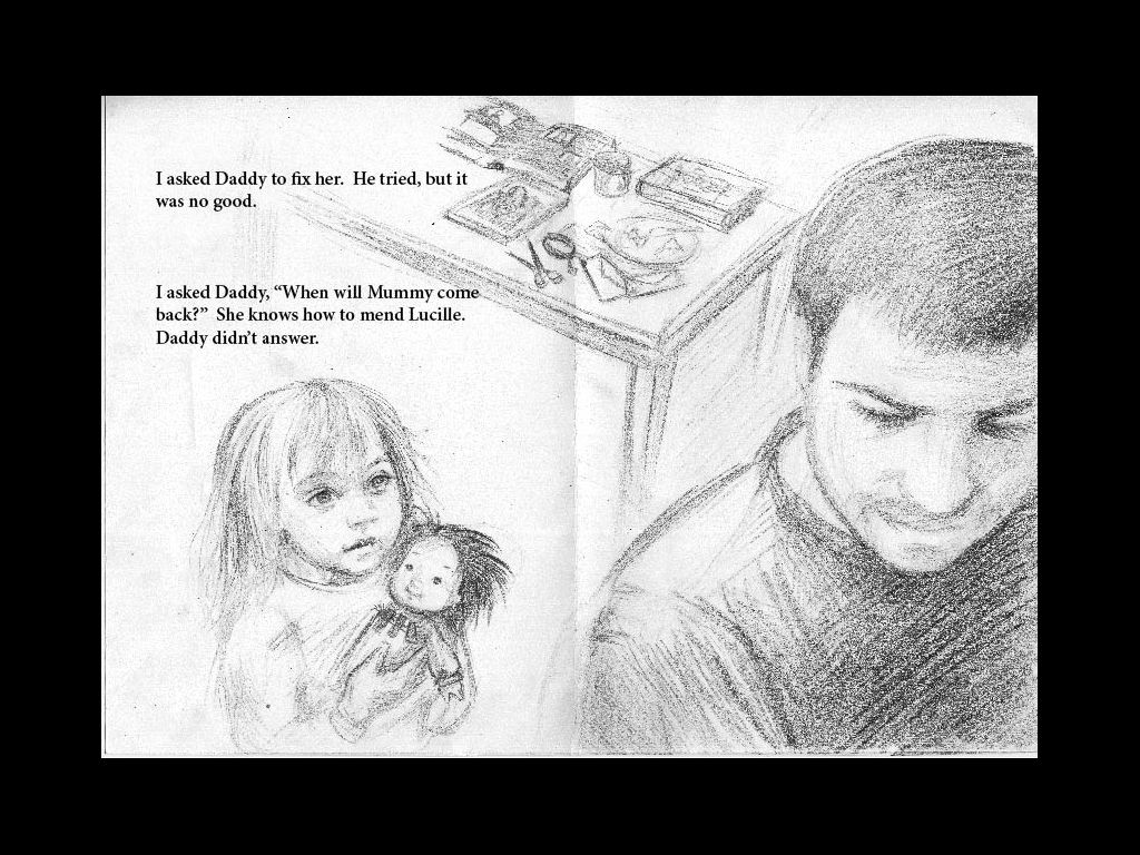
The next step is to begin thinking about how the characters would be positioned, and what their expressions and body language would be like. I didn't bother drawing the mum in this one - just kept her in mind for the final. I knew I wanted the little girl to look small and powerless, but hopeful, and the dad to be shadowed and turning away, distant and blocked and unable to reach out to help her. The key line of text for me on this page was "He tried, but it was no good". I wanted to highlight the fact that the little girl's father couldn't give her what she needed.
Next I had to start working on the layout, changing the size relationship of the characters and adding the mother's silhouette, so that the concept was clear. At this stage, I sent it through to the publishers for approval. They were a bit worried that the torn edges might come across as a bit too harsh and violent, but in the end we decided that it was necessary.
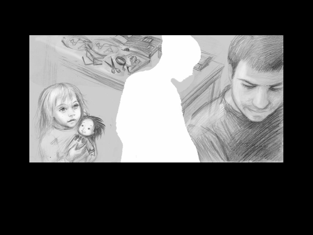
The next step was to draw the whole thing up in the right proportions to fit the size of the final book. This is my underdrawing for the final painting. I did fairly detailed underdrawings with ink wash pencil, then sealed them and put down the oil paint over the drawing. I've just left the mother's silhouette white.
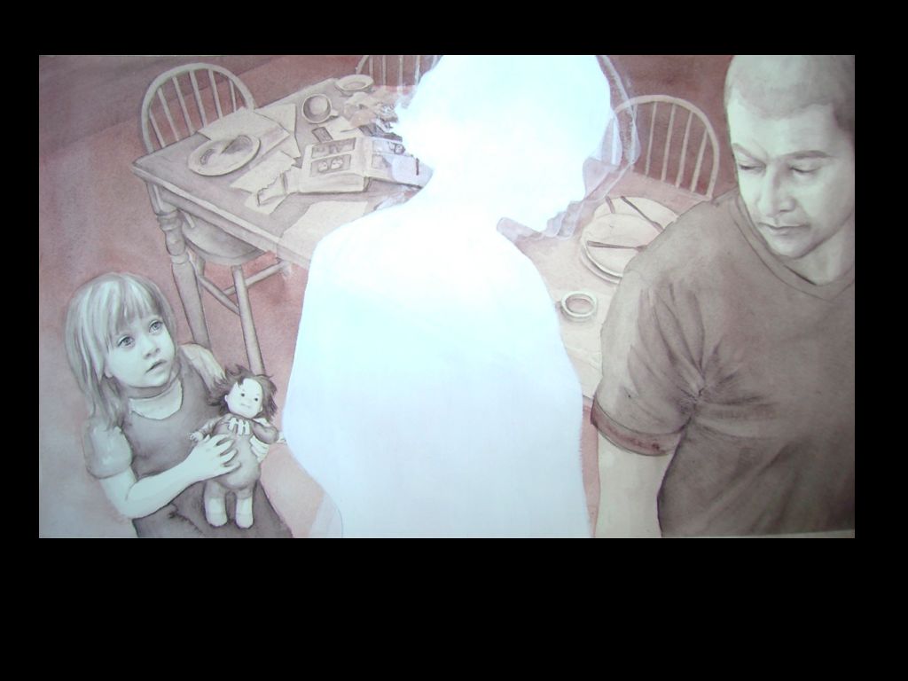
The final painting, with the text laid out by the designer. you can spot a few changes I made to the characters as I worked on the painting - the dad especially evolved quite a bit (because my underdrawing was a bit rubbish!). When the painting was finished, I actually tore it in half to make the shape of the mother - it nearly killed me! I was so nervous that I'd ruin the whole thing. Actually, just as I tore into it, with my heart in my mouth, my kids and a whole gang of their friends came screaming into the room... the shrieking of five year olds is not good for the nerves when you're tearing up days of work. Then I mounted the two halves on a backing paper which I'd painted the cloudy grey which was the dominant color through the book. Phew! Done!
