SCBWI Australasia Biennial conference
This weekend I was lucky enough to be one of the speakers at the Society for Children's Book Writers and Illustrators biennial conference for the South Pacific region, held at the lovely old Hughenden Hotel in Woolahra, which is the new official headquarters of the Australian branch of SCBWI - brass plaque on the gate and all. It was organised by the Dynamic Duo Susanne Gervay and Chris Cheng. There were delegates there from Hong Kong, New Zealand, Singapore and Australia. It was a great weekend with talks by the editors of Chronicle Books, Penguin, Harper Collins, Random House and Walker, as well as some famous, fabulous authors and illustrators like Ellen Hopkins, Jackie Ffrench, Bruce Whatley, and Jenni Mawter. SCBWI Australia will be posting a full report on their website, so I'll link to that when it's up, because they'll do the whole thing more justice than I ever could.
I had a lot of writers tell me that hadn't known anything about the process that their manuscripts go through once they're sent off to be illustrated, and that they had no real idea how illustrators went about interpreting a text and translating it into images, so they liked seeing what I'd done with Mending Lucille. I thought that was interesting - it seemed to be a big gap in the author's experience of how their book gets turned into a tangible reality. Jennifer and I ended up emailing a lot while I was working on Mending Lucille, because she was the one who found me to work on it, but I think it's pretty rare for the author and illustrator to have anything to do with each other.
Anyway, given the amount of interest there seemed to be, I thought it wouldn't hurt to post a potted version of my slideshow here.
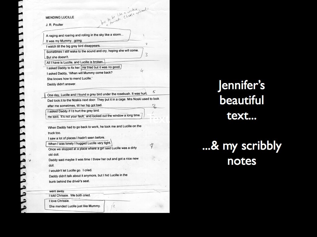
Once I'm sent the text, I read though it again and again, trying to absorb the atmosphere of the words, and let any evocative images rattle around in my head. With Mending Lucille, that meant going through at least a box of tissues, because every time I got to the ending I'd get all teary. What a sook. Here's the intial printout of the manuscript with my scribbles all over it. At this stage I'm just trying to isolate key phrases or images that I want to highlight in the illos.
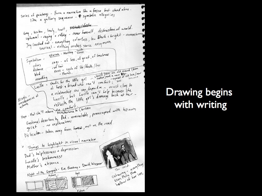
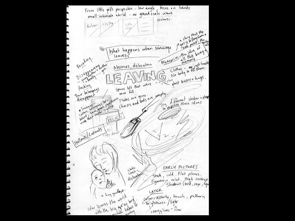
Then I actually start by writing and scribbling, sorting out my ideas about key images, ideas, color schemes, character relationships, anything that comes to mind..
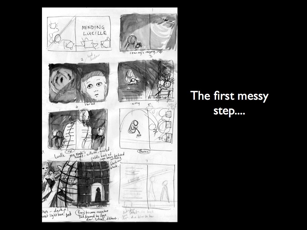
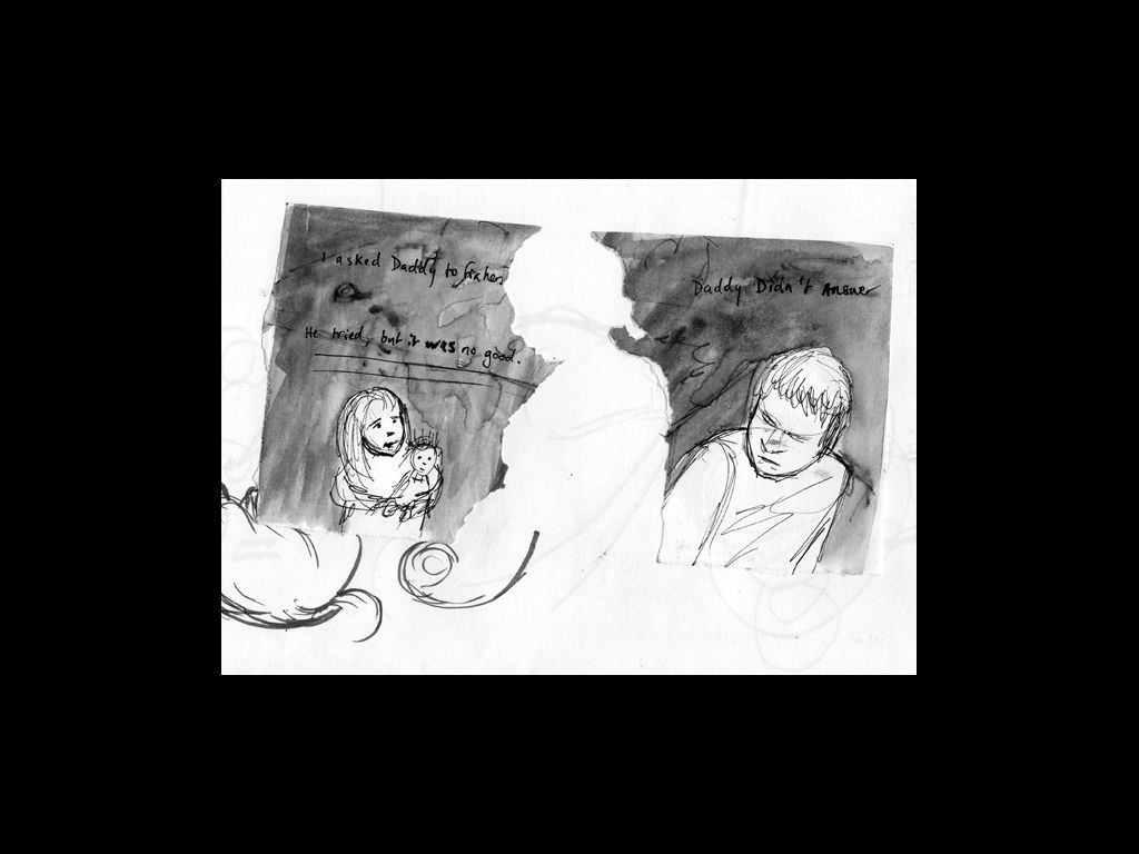
The next stage is to begin translating these ideas into images. At this stage it's unbelievably messy - scribbly, tiny thumbnails that no-one but me can understand - and even I have trouble! But here I start to think about how some of the key ideas would work visually.
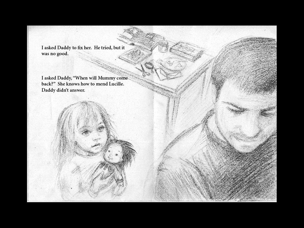
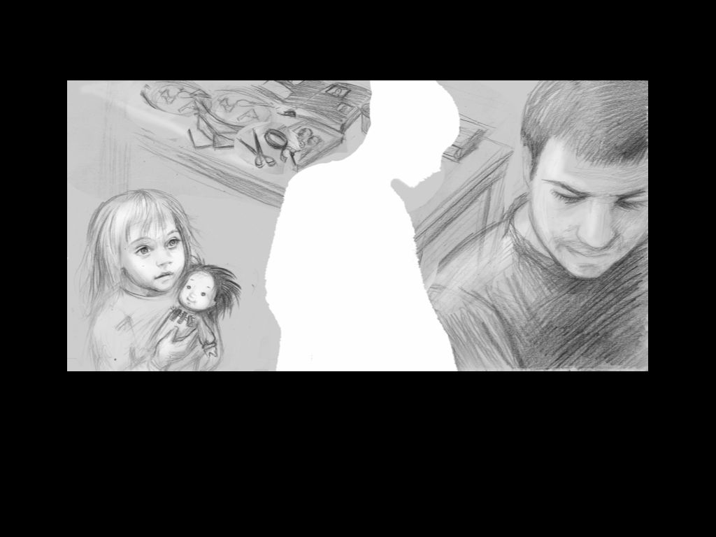
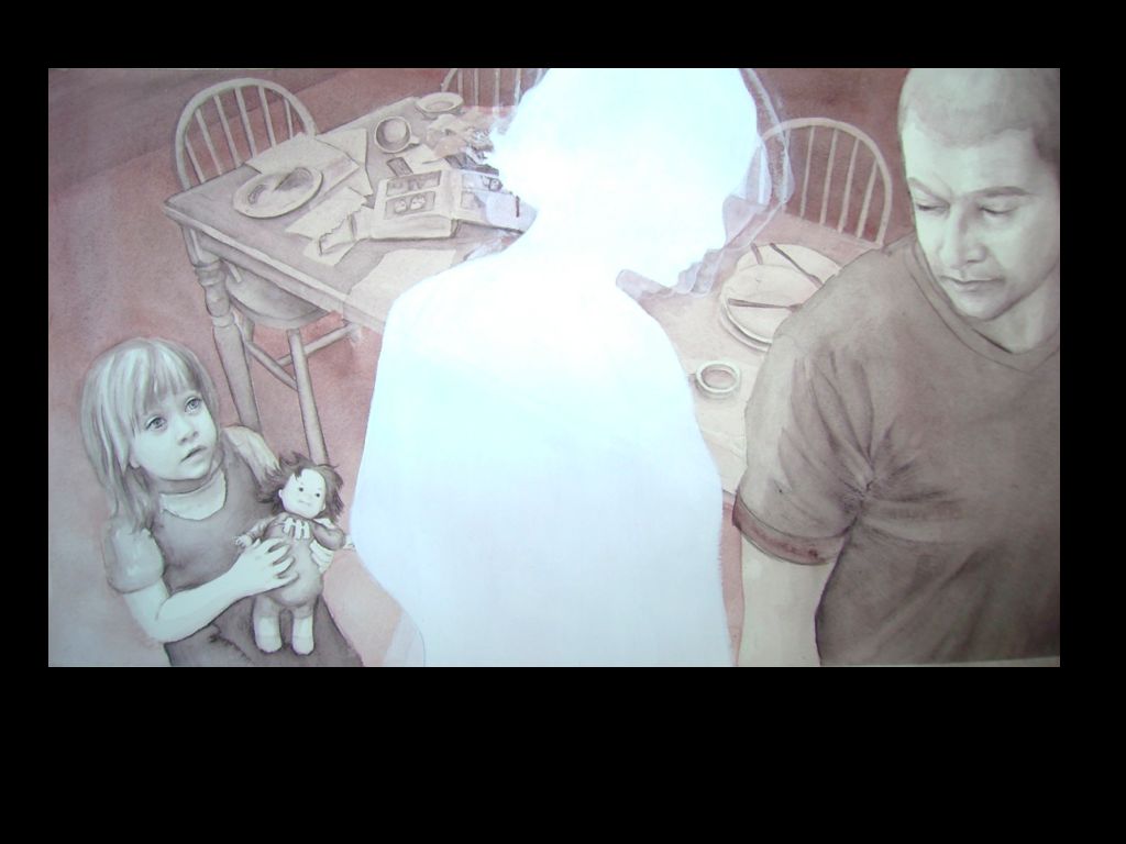
In this book I wanted to play on the idea of breaking and mending, since the story essentially focuses on what happens when the little girl's reality is torn apart, and how she ultimately puts the pieces back together again. So I decided to use collage with lots of torn edges and actual stitching in the final illustrations. Here's one of the illustrations followed from initial rough idea to final art with text.
I wanted this spread to emphasise the trauma of the mother's absence, the loneliness and sadness of the little girl and her father, and the distance between them. All the early spreads are fairly monochrome, and have that stormy grey as a dominant color. I actually painted all the images in this book using only 5 colors plus black and white. As the story got happier and the little girl began recovering from her loss, I just mixed the same colors in different proportions to create a much more bright and vibrant palette.


